The problem
LionCash's deposit flow is hard to find and confusing to use, driven by low visual hierarchy, poor feedback, and lack of user control.
Every semester, thousands of Penn State students use LionCash. Whether it's to pay for food at the market, eat at the dining hall, or pay for laundry. It’s a fundamental currency to live on campus. However, many students like myself find the process of adding money to your LionCash complicated. It’s hard to find the website in the first place, and once you do, the process is tedious.
Many students may chalk it up to “it just looks confusing.” But as a designer, that is only the surface-level issue.
Why this matters
Students often deposit money in high-pressure moments: while standing in line for food, outside a dorm laundry room, or minutes before class. The redesign prioritizes clarity and confidence under such time constraints.
Scenario: Alex realizes too late that he has insufficient funds while doing laundry at 11 p.m. He already walked 5 minutes to the community center, dropped some of his clothes on the way, and is extremely frustrated. He needs to add money quickly, confirm the transaction went through, and return back to his dorm to cram for a 8am exam.
Goals
User Goals
Transfer money quickly, smoothly, and easily.
- Speed is very important, especially for students. I know a lot of students who don’t realize they need to transfer money into their LionCash, until they try to pay for their laundry and the screen reads, “Not enough balance.” At that point, students are standing in front of the washing machine, already stressed and want to transfer money as quick as possible.
- Students also want a clear flow, being able to go back to the previous page if a mistake occurs.
- Students want clear feedback that the money has been transferred.
Inferred Business Goals
Efficiency, trust, and risk mitigation.
- Penn State wants to reduce the number of complaints filed with IT because students are unable to transfer their money properly.
- Penn State also values a seamless experience and wants their organization to be associated with clean interfaces rather than outdated websites.
- Ensuring the transaction process is clear so students don’t make mistakes, like depositing the wrong amount, reduces burdens for the university.
Heuristic evaluation
Before sketching solutions, I conducted a heuristic evaluation to identify the underlying usability issues rather than redesigning based on aesthetics alone. Afterwards, three issues stood out to me the most: poor scanability, limited user control, and uncertainty throughout the experience. These findings shaped the direction of the redesign.
1. Recognition Rather Than Recall
Every element competes for attention, so users have to work to find the one action that matters: depositing money.
The interface places a high cognitive burden on users. Dense text and weak visual hierarchy force users to read and decide where to focus, rather than seeing it at a glance. Depositing money is the site's core function, yet every button shares the same visual weight. There's no clear signal of what deserves the user's attention first.
Small, low-contrast text compounds this, adding barriers for users with visual impairments and raising cognitive load for everyone.
2. User Control and Freedom
Users have no reliable way to undo a mistake or step backward without restarting the entire flow.
Several steps offer no way to return to a previous screen. This is most obvious on the confirmation page, where a "Cancel" button gives no indication of what it actually does. Does it return to the previous step, the home page, or discard everything?
Unpredictable navigation erodes user confidence in the system.
3. Error Prevention and Recovery
Products should not be designed for ideal conditions. The flow doesn't anticipate mistakes, unclear input, or moments of hesitation, it only accounts for the ideal path.
- What happens if a user enters an invalid amount?
- What happens if they type letters instead of numbers?
- What do loading and error states look like?
- How does the user know where they are in the process?
During my evaluation, I encountered blank loading screens, alarming error messages, and vague calls to action. For example, the button label "Next" provides little context about what will happen. A label such as "Continue to Confirmation" better communicates the user's next step and reduces uncertainty.
These findings ultimately shaped the sketches and redesign decisions that followed.
Constraints
Before ideation, I had to get specific on what I could and could not do.
This design is constrained by the existing web architecture of the Transact eAccounts portal. I cannot alter the underlying payment processing security protocols or the way the university authenticates students via Web Access.
I am constrained by Penn State’s visual identity and branding guidelines, which limit my ability to deviate from the existing color palette or typography.
Ideation
Each sketch tested a different way to resolve the visual hierarchy problem identified in the heuristic evaluation.
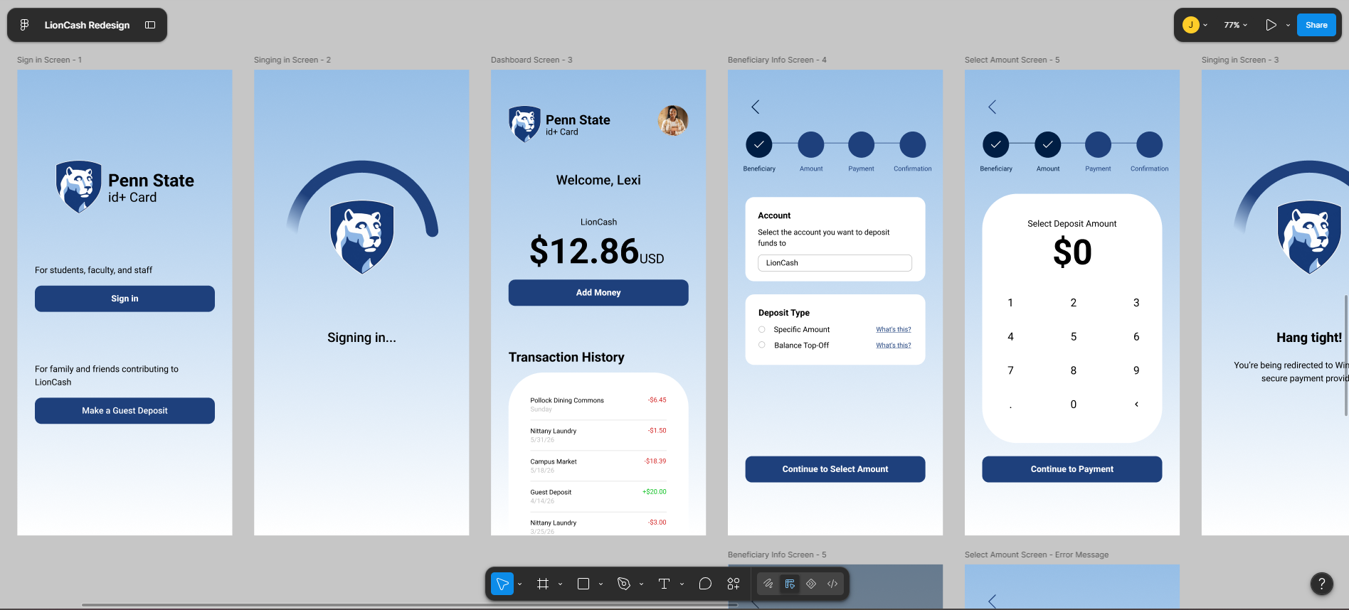
Decision: Make the balance and “Add Money” the dominant elements.
The original dashboard gives account information and actions similar visual weight, making the deposit task harder to identify. I prioritized the current balance and “Add Money” instead, while keeping secondary account details accessible through the profile menu.
Tradeoff: Users see less information upfront, but the primary task becomes immediately recognizable.
Decision: Make system status visible during loading.
The original experience uses blank screens while data loads, leaving users unsure whether the request is being processed. I introduced explicit loading and transition states to communicate that the system is actively working.
Why: In a financial flow, uncertainty can make users wonder whether to wait, refresh, or submit again. The original website relies on jarring blank white screens during data fetches, leading to user anxiety. I introduced engaging transition and loading states to reassure users that their requests are actively being processed.
Decision: Give users persistent orientation and predictable navigation.
I added a step indicator at the top of each screen and a consistent back button throughout the flow.
Why: The original experience gives users little indication of where they are or how to recover from a previous step. Persistent progress makes the transaction feel finite, while predictable back navigation gives users control if they need to correct an input.
Decision: Make amount entry the primary interaction.
I designed a large keypad with visible deposit limits and inline validation for amounts below $0.01 or above $2,000.
Why: The deposit amount is the user's most important input. Showing constraints and errors inline lets users correct mistakes before submission rather than discovering them afterward.
Decision: Make completion unambiguous and prevent redundant actions.
The final screen confirms that the deposit succeeded and gives users one clear next step: return to the dashboard.
I intentionally removed the back button after submission. At this stage, allowing users to navigate backward provides little value and could create ambiguity around whether the transaction has already been processed.
Tradeoff: Less navigation flexibility after completion, but a clearer and safer end state.
Wireframes
I used my sketches as the foundation for low-fidelity wireframes, using iPhone 16 frames with an 8px grid and a four-column layout to maintain consistent spacing and alignment throughout my redesign. Working within such a system early on helped me focus on information hierarchy and user flow.
At this stage, my priority was structure. I used placeholders for headings and personal information so I could focus on questions like:
- What should users see first?
- Which actions deserve the most visual weight?
- How can navigation reduce uncertainty?
- Where should feedback and error states appear?
Final design
BEFORE
AFTER
Want to see for yourself?
Original LionCash prototype (screenshots)
Figma Redesign prototype
The final interactive prototype brings the redesigned deposit experience together, guiding users from authentication and account status through deposit selection, payment, and transaction confirmation.
I translated the structural decisions from my wireframes into a high-fidelity experience, using reusable components and consistent visual patterns across the flow. I also introduced a subtle light-blue gradient inspired by Penn State’s visual identity to create a cohesive visual system while keeping the deposit journey as the primary focus.
One interaction I refined during high-fidelity design was the Beneficiary Info screen. When users select “What’s this?” to understand the difference between a Balance Top-Off and a Specific Amount, I added a background fade to reduce visual competition from the underlying screen and direct attention to the explanatory message.
After finalizing the prototype, I moved into usability testing to evaluate whether these design decisions actually improved the experience..
Testing
I wanted to know one thing: did the redesign actually make depositing money feel easier? I recruited 4 Penn State students and asked each participant to complete the same task on both the original and redesigned interfaces. Task: Add money to your LionCash account.
After completing each task, participants rated their frustration on a 1–5 scale, with 1 = not frustrated and 5 = extremely frustrated.
Original interface: 3.0 / 5 average frustration
Redesigned interface: 1.125 / 5 average frustration
That's a 62.5% reduction in reported frustration.
The redesign produced a substantial decrease in reported frustration, suggesting that clearer hierarchy, navigation, and feedback helped participants complete the task with less friction. However, with only four participants, I consider these findings directional rather than conclusive.
What I observed
On the original interface, participants frequently pointed out how there were several words on their screen. One user stating, "It is a lot of work to read, and maybe it's necessary, but I definitely don't read too much of the screen. I [also] never click on any options at the top and mostly focus on the deposit itself."
This reinforced one of my initial findings: users were primarily focused on completing the deposit, while much of the surrounding information competed for their attention.
The redesign responded by giving the deposit action stronger visual hierarchy and reducing the amount of competing information on screen.
Reflection
This project taught me to treat design decisions as hypotheses rather than conclusions. I was able to identify usability problems through heuristic evaluation, but the process also showed me where my assumptions had limitations.
1. Start with users, not just heuristics.
I relied heavily on heuristic evaluation to identify problems in the original experience. If I were to do this project again, I would recruit students for user interviews before beginning the redesign. This would help me validate which problems actually affect users and uncover issues I may have missed.
The heuristic evaluation gave me a strong starting point, but without early user research, I couldn't know whether the issues I identified were the issues users found most frustrating.
2. Recruit more participants for usability testing.
I tested the original and redesigned experiences with 4 Penn State students over Zoom. While reported frustration decreased substantially, I would recruit more participants in a future round and measure additional indicators such as task completion time, errors, hesitation, and task success.
These measures would provide a stronger picture of whether the redesign improved not only how the experience felt, but also how efficiently and accurately users could complete the task.
3. Test my assumptions earlier.
I spent much of the design process solving problems I had identified myself. In a future iteration, I would introduce users earlier rather than waiting until the final design. Early testing could help validate the direction before investing as much time in high-fidelity design.
The biggest lesson I took away is that good UX isn't about being confident that my solution is right. It's about being willing to test it, learn from the evidence, and change it when the evidence says otherwise.